passion project
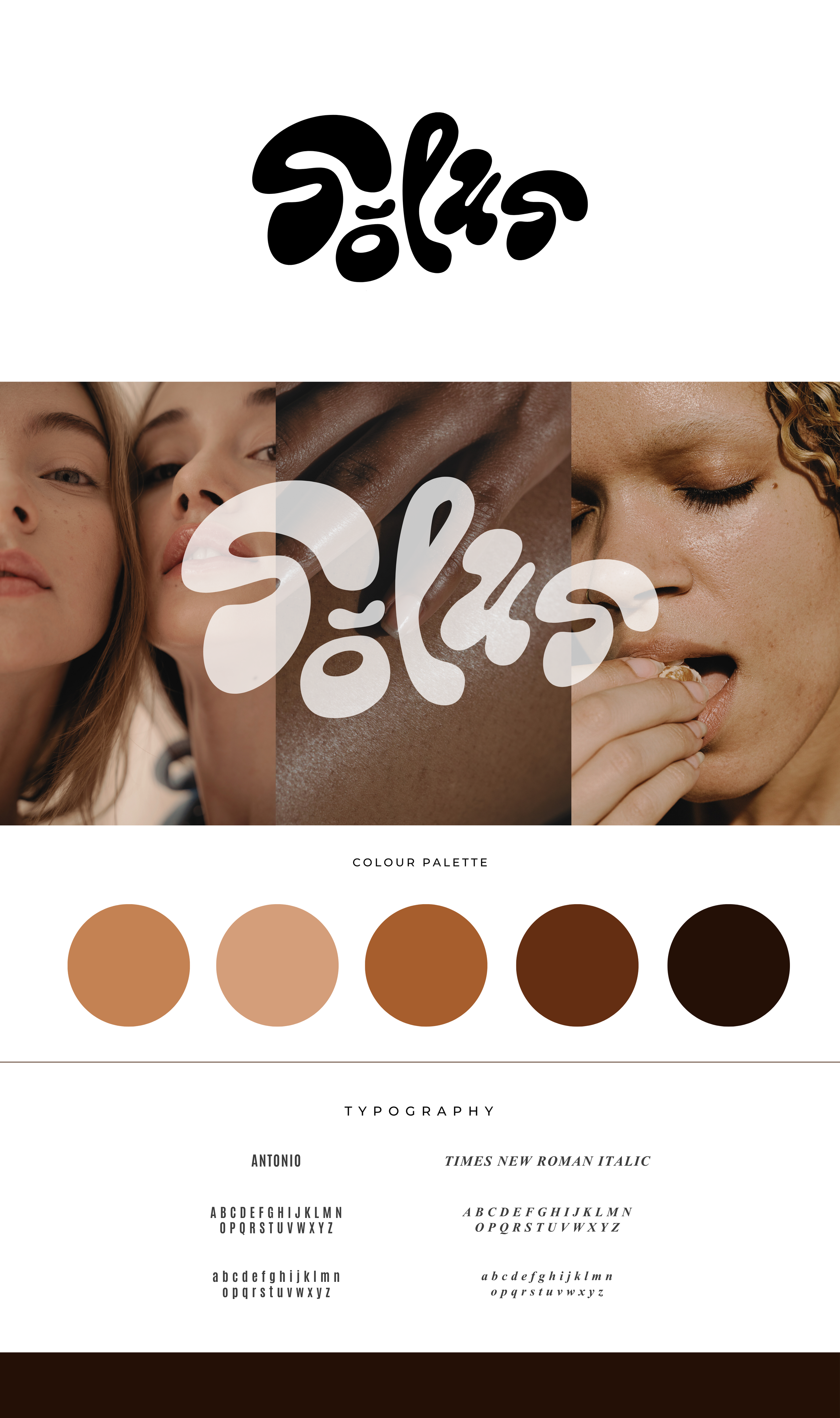
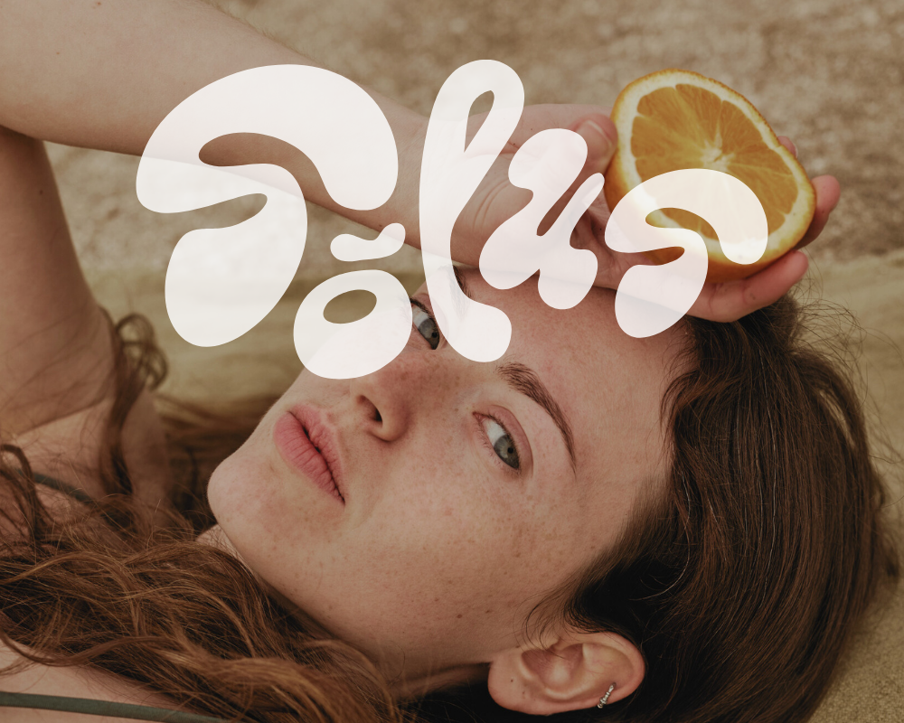
solus / brand identity
challenge.
Minimalism in beauty has long been synonymous with cold whites and sterile perfection. Solus set out to change that. To create a beauty brand that felt alive, tactile, and deeply human. The goal was to redefine minimalist design through warmth, diversity, and individuality - where every tone and texture is celebrated.
concept.
The identity was built from the ground up to redefine minimalism through a balance of structure and softness that feels human, not sterile. Every element reflects that idea: an organic, fluid logo inspired by the natural curves and movement of the human form; a palette of rich, earthy tones that honour the diversity of natural complexions; and a typographic pairing that bridges modern confidence with timeless elegance. The visual language leans into natural light, texture, and quiet imperfection - embracing presence over polish, and emotion over austerity.
impact.
The result is a brand that feels human, confident, and quietly powerful. Solus redefines minimalist beauty as something intimate and alive.
By blending organic form with refined restraint, Solus invites a new way of seeing beauty: not in the absence of detail, but in the richness of what’s real.
CREATIVE.
CREATIVE.