botanicals
botanicals / brand identity
challenge.
Create a skincare brand that feels as gentle as the products themselves. The goal was to bridge the gap between nature and nurture, to design something that looked pure and honest, but still desirable and gift-worthy. Many natural skincare brands relied on earthy, muted tones or clinical minimalism, so the challenge was to craft an identity that felt fresh, feminine, and quietly confident.
concept.
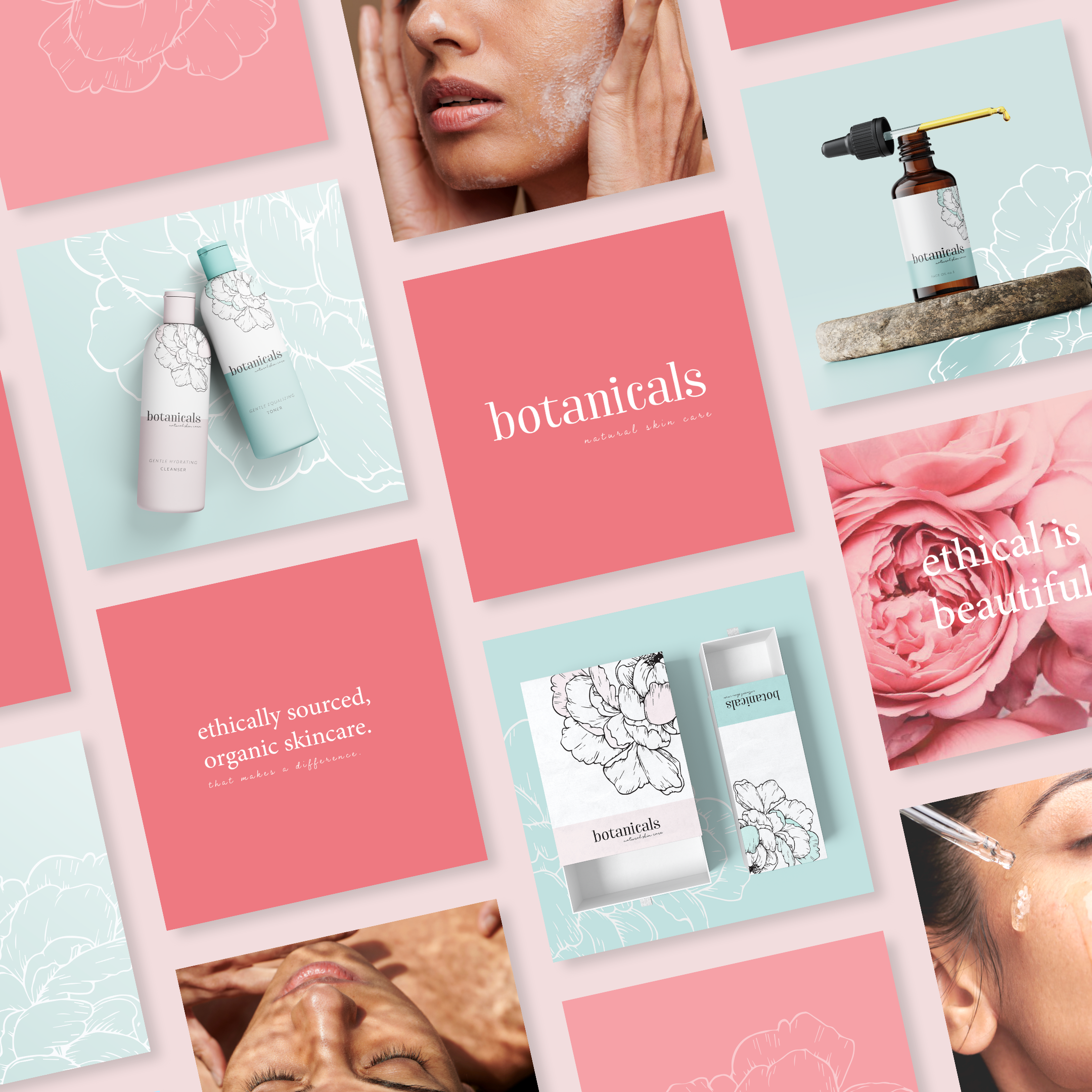
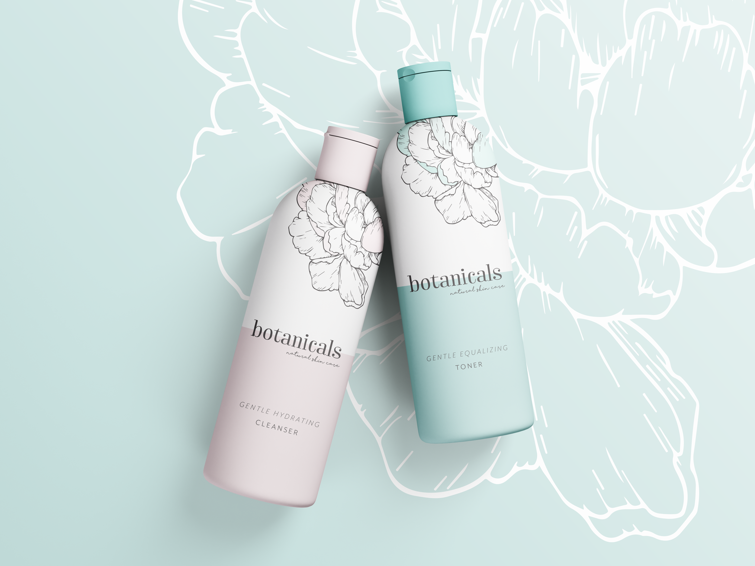
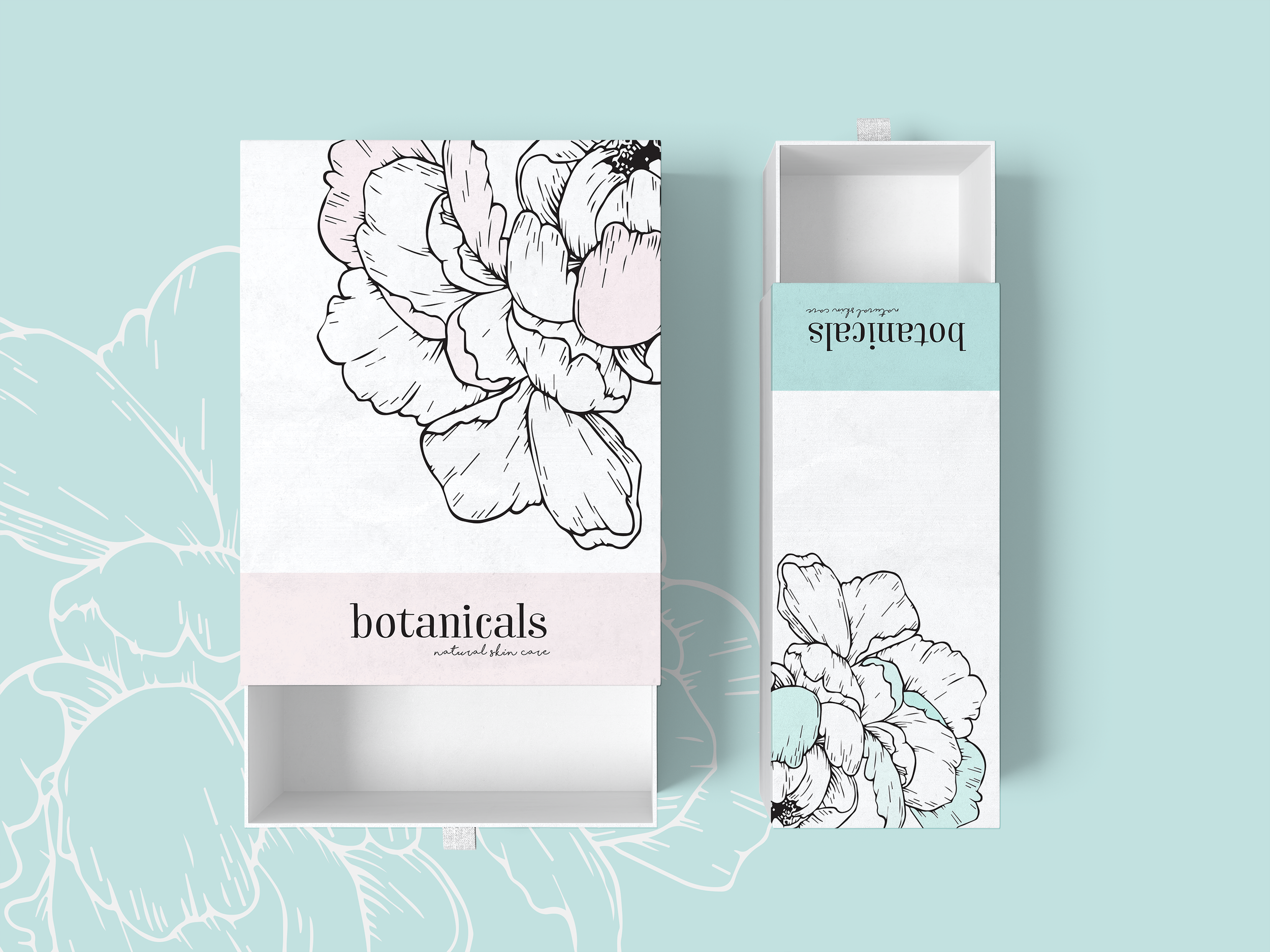
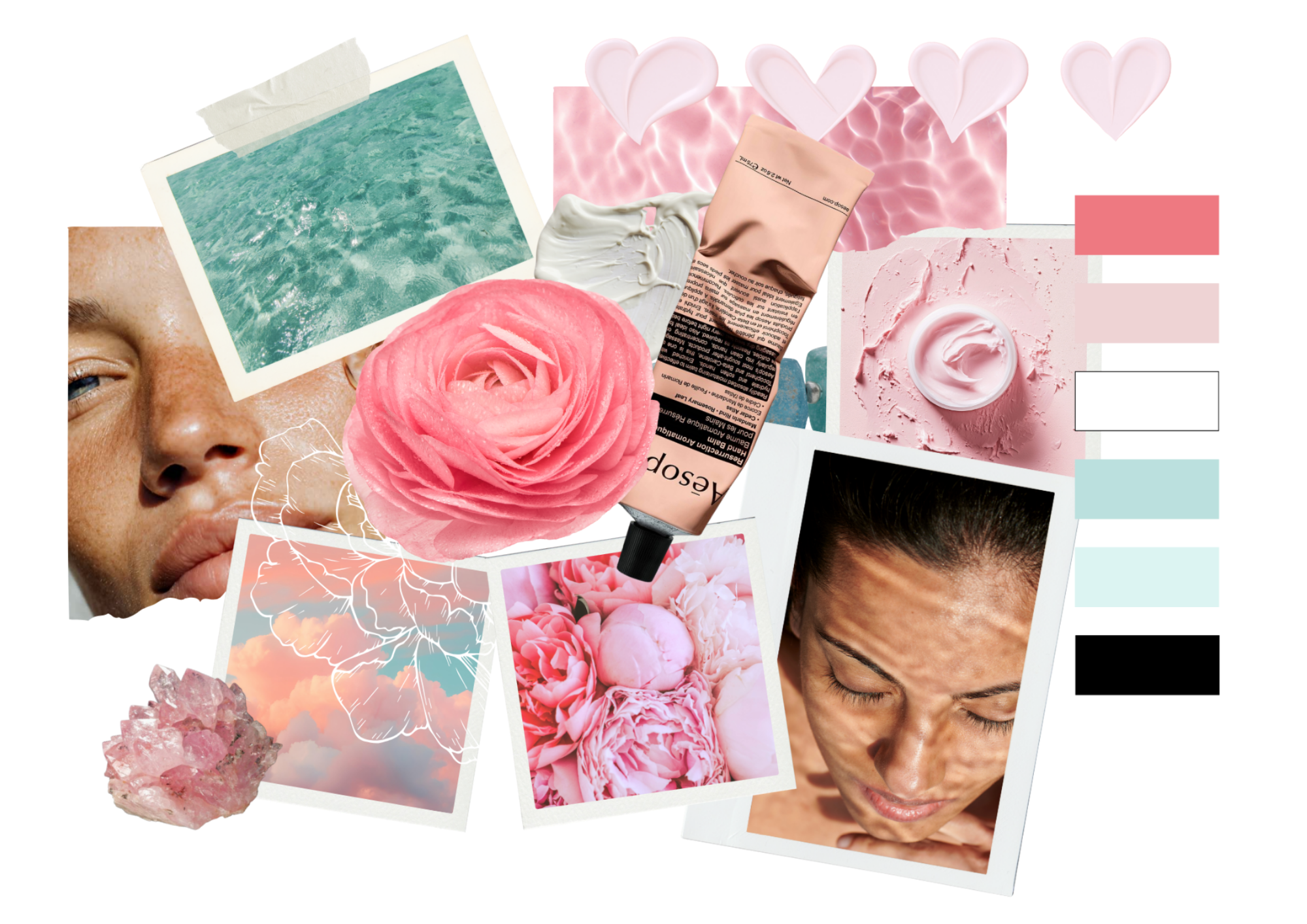
The idea behind Botanicals was to capture the calm beauty of nature through colour and texture. Soft pastels of petal pink and ocean aqua set a soothing foundation, contrasted by fine botanical line drawings that hint at natural ingredients without feeling rustic.
The typography is elegant but unpretentious, and the visual language celebrates light, water, and touch. Moments that feel both nurturing and alive. Every element, from packaging to photography, was designed to evoke that fresh-from-the-water feeling of calm, clean skin.
impact.
The final identity feels effortless and cohesive, modern yet soft. Botanicals stands out in a crowded category by embracing softness as strength, proving that natural skincare can be both kind to the planet and beautiful on the shelf. The palette, imagery, and tone work together to create a sensory world that feels like a breath of fresh air in skincare branding.
CREATIVE.
CREATIVE.