CHEF HUGO LERON
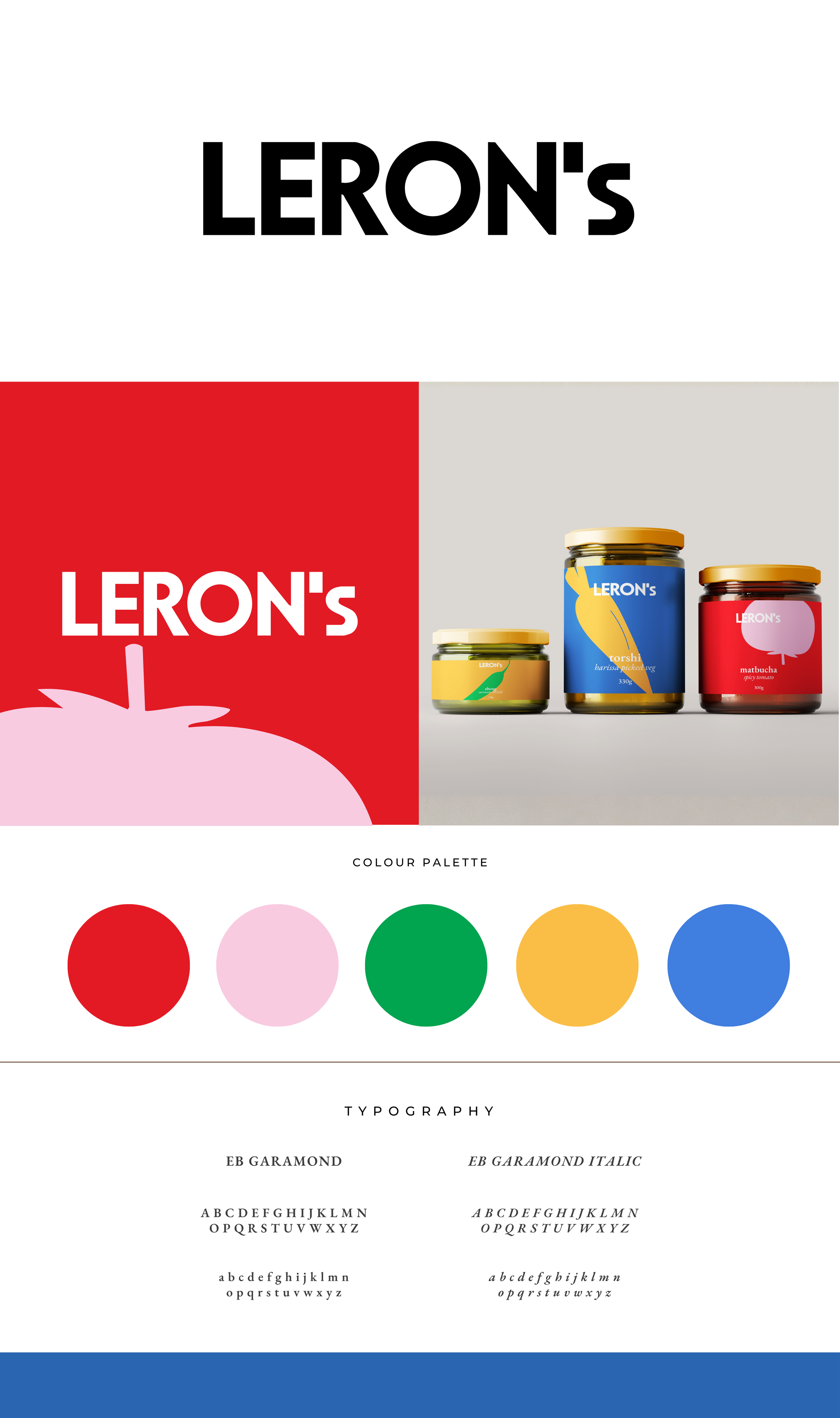
LERON’S / brand identity
challenge.
After years of success as a chef in both Israel and Australia, Leron set out to create a premium range of his signature condiments and sauces for upmarket delis across Australia. The challenge was to build a brand that felt refined enough to sit beside high-end artisanal products, yet bold and contemporary enough to stand out on crowded shelves.
concept.
The identity celebrates Leron’s bold culinary personality through colour, form, and typography. A striking red and pink palette anchors the brand with warmth and appetite appeal, balanced by clean modern type and playful produce illustrations. The mix of heritage-inspired serif typography (EB Garamond) with crisp geometric forms creates a bridge between authenticity and modernity, capturing both his Mediterranean roots and cosmopolitan flair.
impact.
The final identity positions Leron’s as a confident, design-led food brand that feels premium but approachable. The strong visual system extends seamlessly across packaging and digital touchpoints, giving the brand a distinct presence in gourmet retail environments. The vibrant palette and minimalist design instantly communicate quality, freshness, and personality, setting the stage for expansion into new products and markets.